Examples of bad design
Design is hard. Don Norman, author of the wonderful book The Design of Everyday Things (written in 1988 and still a classic!) asked a question in the first five minutes of a recent talk:
Imagine you’re on the first slide of your powerpoint presentation and want to move to the next slide. Your remote control has two buttons. They are unmarked, but one button points up and one button points down.
Which button do you press?
It turns out that half the people would press up, half the people would press down, and everybody thinks their choice is obvious.
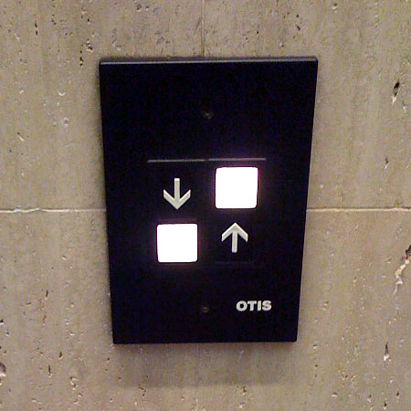
Even in cases where most of us get it right (like elevators), some are still confused. So it is easy to make mistakes, especially when designing the interface to a complex system. But it takes a special genius to take something simple and make it confusing:

Do the arrows describe the buttons beside them?
(from Stack Overflow.)
lovely :)
aadityaramdas
Wed, 2010-06-30 at 04:24:10
I think down is the obvious choice
Preyas
Wed, 2010-06-30 at 13:50:18
Yeah, as he explains, it probably depends on whether you imagine the presentation to be moving, or yourself. If you think of the presentation as a page or screen, you may want to press the down button, but if you think you want to move “forward”, it is more natural to press Up. :-)
S
Wed, 2010-06-30 at 14:10:32
And good design would be to have the buttons “forward” and “backward”?
Preyas
Wed, 2010-06-30 at 14:14:28
Most probably (and placed on the right and left respectively). We can’t be sure until we test it on a few users and see how they react. :-)
There is something strange about those (like me) who think the natural buttons are “right” rather than “left”, “forward” rather than “backward”, and “down” rather than “up”, and yet when asked whether “up” or “down” is forward, would answer “up”. :-)
S
Wed, 2010-06-30 at 15:17:56
I think the 1st and 2nd choices are universal, I would guess the 4th choice is also very common, and the 3rd choice might be because we are used to working with beamer created pdfs
Preyas
Wed, 2010-06-30 at 16:07:57
This up/down confusion also happens when using navigation in touchscreens versus mouse navigation. When you move your finger up the touchscreen, it is typically taken that you are dragging the touchscreen up, which means that material lower down now appears on the screen. But mouse navigation is usually the opposite.
A similar confusion happens with “previous posts”, “next posts”, “previous page”, “next page” in lists of blog entries. This blog, for instance has separate descriptors for entries and pages (scroll to bottom), so “previous posts” = “next page” and “next posts” = “previous page”.
vipulnaik
Thu, 2010-07-01 at 09:51:28
Yes, in touchscreens. It also happens in several PDF readers, where moving the “drag” tool down moves the text up. (Again, it’s a question of whether the text is moving or the ‘window’ through which you’re viewing text is.)
Your example with “previous posts” and “next page” meaning the same thing is a good one… I think this could be solved by having “older posts” and “more recent posts”, and placing them left-right or right-left arbitrarily. (Perhaps down-up would be better, since blogs already create an expectation of newer posts being at the top.)
S
Thu, 2010-07-01 at 12:26:10
here the upward arrow indicate up and down arrow indicate down .i found it by seeing the name written at the last.
neeharika
Sat, 2010-08-21 at 00:14:25
It is clear that the upward arrow indicates up and download arrow indicates down, but the question is: does each arrow describe the button it is pointing to (in which case it’s odd to have descriptions on the same line as the other button) or does it describe the button it is adjacent to (in which case it’s very odd to have the higher button indicate “down”)?
S
Tue, 2010-08-31 at 19:22:20
[…] The placement of buttons in relation to their labels is something that always irks me. Here’s a great example via The Lumber Room. […]
» Button placement Design Fail
Sun, 2012-02-26 at 04:05:31
[…] Souce: https://shreevatsa.wordpress.com/2010/06/29/examples-of-bad-design-2/ […]
Design | Interaction Design
Mon, 2013-03-04 at 07:44:10
[…] From “Examples of Bad Design“ […]
Making martech usable
Tue, 2017-05-23 at 10:05:42
[…] From “Examples of Bad Design“ […]
Making martech usable - Internet Marketing
Wed, 2017-05-24 at 12:33:14
[…] From “Examples of Bad Design“ […]
Making martech usable | IM How To & News
Wed, 2017-05-24 at 21:51:00